There are over 1.8 billion websites in the world, according to the Netcraft January 2018 Web Server Survey.
Do you think your website stands a chance against them?
We both know the answer.
Unless you’re Google (or a major player in your industry), there’s a lot of work involved in designing a website that’s visible on the internet and benefits your business.
Gone are the days of “brochure websites”.
Now, it’s about building a website that attracts the attention of your visitors and contains psychological & marketing triggers to turn them into customers.
With increasing competition in the digital space, your business website has to level up and become more than just a pretty online face.
Your website needs to strike a balance between practicality and pleasing allure.
In fact, today’s websites even have the functionality of a 24/7 inbound lead-generating machine that works on autopilot mode.
Sounds too good to be true?
I don’t think so.
There’s no doubt that your website is the biggest marketing tool for your business.
Being a part of an inbound marketing agency, I can even swear by the effectiveness of websites for generating leads and supporting business activities worldwide.
So, what’s better than powering it up with some strategic + creative muscle to improve its effectiveness by 10 times?
Take the example of HubSpot - a world leader in marketing software and CRM.
Their website is loaded with hundreds of blog articles, custom calls-to-action and free content offers.
Paired with solid inbound marketing tactics, their website ranks number 5 in the marketing world.

And that’s just one example.
Although it may take you quite a while to reach that milestone, it’s never too late to improve your own business’ website.
After all, Rome wasn’t built in a day.
In this article you'll learn 10 actionable website design hacks that will improve the effectiveness of your marketing campaigns.
In other words..
Your website will not only look better, but will also be ready for your customers' demands.
You’ll learn to attract the attention of your visitors, collect their data seamlessly, provide a pleasing browsing experience and of course, generate revenue for your business.
So, if you want your business to set an example for itself (and others), use the tips in this article to turbo-charge your website's performance.
Let’s make your website win hearts and business.
10 Website Design Hacks to 10x Your Inbound Marketing Efforts
1) Have a Value Proposition
Here’s the harsh truth.
Your website shouldn’t contain tons and tons of data about your company.
It’s simply redundant.
The focus here should be on delighting your users with content that appeals to them and guidance on actions you want them to take.
Remember, your website visitors care about how you can benefit them - whether it’s about finding information they’re looking for, ease in helping them sign up or availing your products and services.
That’s why your website should answer this question:
“What should my visitors do?”
After all, value proposition is the number 1 thing that determines whether people will bother reading more about your product or leave your website.
In fact, it’s one of the main elements that decides your website’s success.
Your value proposition is a promise to your website visitors about what they can expect from you.
It’s the main reason that helps you stand out among your competitors and instils within your prospects a desire to trust your brand.
Your value proposition should have at least one of the following 3 characteristics:
- Firstly, It should explain how your product/service solves customers’ problems or improves their condition;
- Secondly, It should list down the exact benefits that can be derived from your business
(For example, “Increase your email open rates by 200%.” (Focus on the numerical benefits of your brand) - Lastly, it should create a unique selling point for your company that separates you from the rest. Make your value proposition a unique differentiator of your business.
Here’s an example of Evernote.
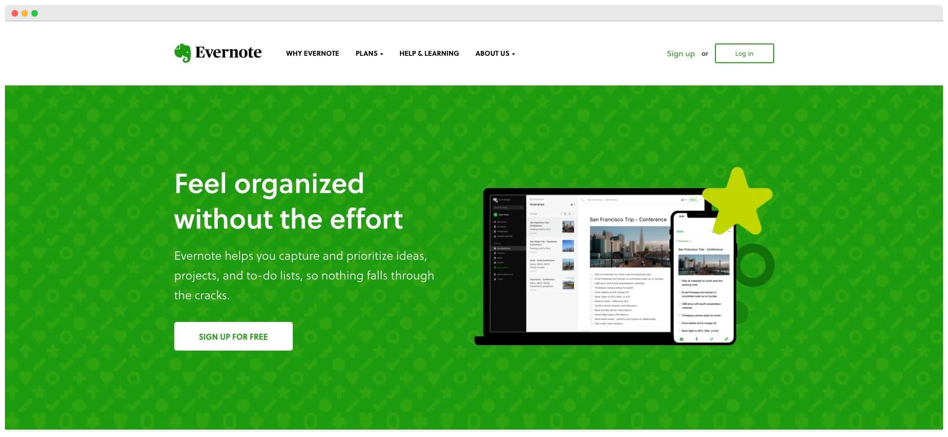
Its homepage explains the features and benefits of using the app/software.
The simplicity in its value proposition helps users build trust and comfort in the brand.
Here are a few tips to help you get the most out of your value proposition:
- Craft your value proposition in simple language that your target audience can instantly understand.
You should do a little bit of audience research to find out their pain points and what delights them.
Base your value proposition around them for the best results; - A survey conducted by Microsoft stated that the average attention span had reduced to eight seconds (as compared to 12 seconds in the year 2000).
Our attention span is literally shorter than a goldfish.
So how does this translate into modifying your value proposition?
Well, try to keep a benchmark of under 8 seconds, within which your website users should understand what they need to do next.
If your visitors need to scramble around menus and sub-menus to find out what you do, you’ve already lost them. - Once your value proposition is ready, place it above the fold.
In other words, make sure it’s on the first page and doesn’t make users scroll further to find it.
If you place your value proposition at the bottom of your website, chances are, your visitors will leave the page without interacting with it.
2) Make Your Content Visual
Mihaly Csikszentmihalyi, author of the book “Flow: The Psychology of Optimal Experience”, states that humans are bombarded with almost 2 million bits of information per second.
Every second!
What’s even shocking, according to him, is that our brain can process up to 134 bits per second.
In website design terms, don’t overwhelm your website visitors with hundreds of words about your vision-mission statement that’s hardly relevant for them.
Instead, make your content visual and pictorial so they can absorb it quickly with ease.
Would you prefer your visitors to rack their brains in segmenting truckloads of content on your website and run out of time to take the desired action?
Or
Would you rather present information that they can absorb in a tenth of a second?
I’d choose the latter any day.
Although I understand that text-based content is quite important from an SEO point of view, make sure to prioritize visual elements in your content cavalry.
There are 6 types of visual content you can use to make your website glow, as stated below:
- Images
- Videos
- Infographics
- Presentations
- Gifs
- Screenshots
Learn more about them in Neil Patel’s comprehensive article here.
SurveyMonkey, the leading creators of online surveys, definitely know a thing or two about making their content pleasantly digestible.
Here’s a screenshot from their website.
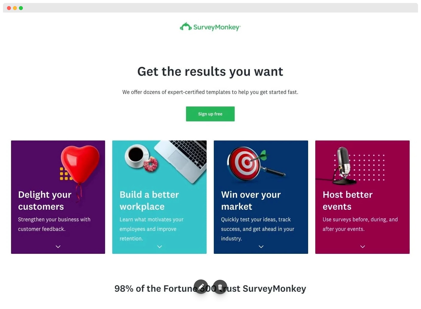
Notice how they use colors and imagery to boost their service benefits.
You could try something similar for your website, if you’re in the service industry.
The point is to make your website less mundane and more merry.
3) Check if Your Pages are Indexed
Having a gorgeous website design is one of the best feelings ever.
But beauty alone isn’t enough to get you found online and generate leads.
So start off by asking yourself this question:
“Is my website getting found on search engines?”
If your target website visitors can’t find you on Google (and other search engines), it’s already game over.
No indexed pages, means no website visitors.
No website visitors means, well, no online presence (and of course, wasted effort)
But it’s not the end of the world!
You can check whether your pages are being indexed (or found) by search engines.
Here’s how you can do a quick check up.
Simply go to Google and type:
site:yourwebsite.com
Replace the word “yourwebsite” with your actual website url name to conduct this simple exercise (make sure there are no spaces between any words)
Check out this example by a website called Kobestarr (below)
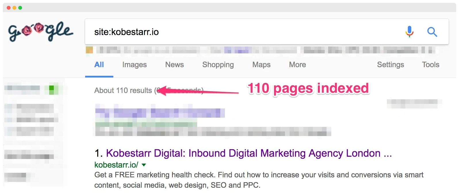
As you can see, they have 110 indexed pages, meaning that Google is able to find and display their website to online visitors.
If your website isn’t indexing, ask your web developer to create a sitemap and submit it to Google Search Console.
To learn about this in more detail check out this article by Hubspot.
4) Optimize Your Website’s Keywords
The keywords you use determine your position in search engine rankings.
For example, if your company provides social media marketing services, but your website has little or no words containing “social media” and related keywords, it’s almost impossible getting found on Google for that service.
Your target audience is using keywords to search for services that you can provide.
So, if you don’t add the right keywords into your content, your website will be of no use in generating leads.
Your aim here is to get discovered by prospects and interested users.
Similarly, if your company provides digital marketing courses, you must generate a list of keywords and use them across your website.
Here’s an example of a keyword list for the same topic:
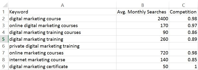
Your objective here is to get found when people search for digital marketing courses.
So, optimize your website using the right keywords to give context to your content.
Doing so, helps search engines understand your website and display it for the right search terms.
Since keywords are an integral part of search engine optimization (SEO), here’s my guide on the 12 SEO elements to help your website rank higher and get better marketing results.
5) Collect Leads using Calls-to-Action
The main goal of inbound marketing is to generate leads for your business using your website.
If you don’t have a lead generating mechanism, there’s no point in focusing on website design.
There are different ways of collecting leads:
You can place customized calls-to-action (CTA) on different pages to help visitors take the desired action
Let’s take the example of Crazy Egg - an online company that provides tools to increase your website’s conversion rates.
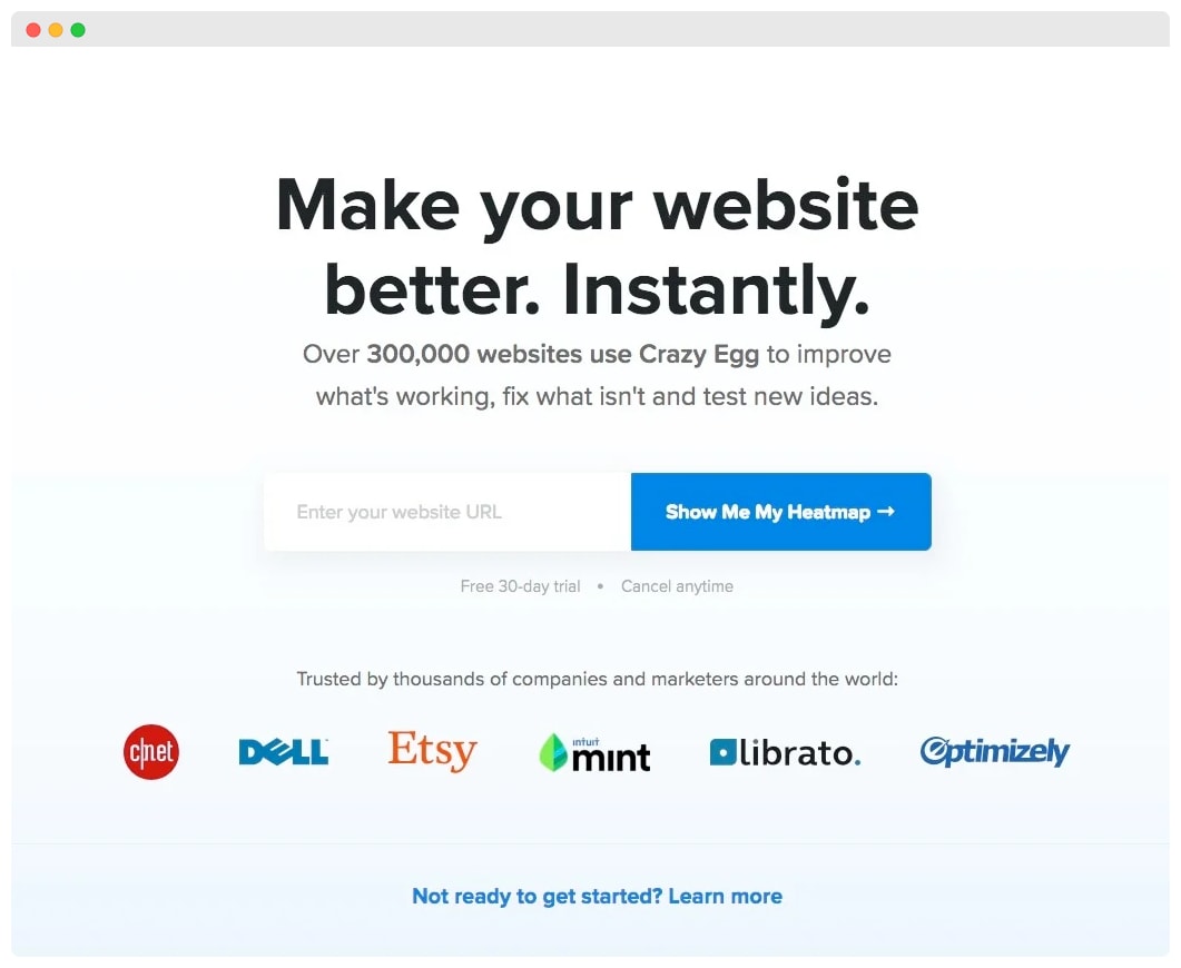
They collect leads by asking visitors to enter their URL for a quick audit of visitor behavior on the website.
With a simple call-to-action like this, they’re able to create a database of companies and individuals who are looking for website betterment solutions.
Since their CTA and value proposition is so concise, there’s less hesitation among website visitors to submit their details.
Here’s an excellent guide by GoSquared on designing high-converting call-to-action buttons.
Another way to collect leads is by asking users to submit their details for a free consultation about their problems and how you can solve them.
You could then direct them to appropriate landing pages to collect their data for future nurturing.
Collecting leads from your website also helps in crafting successful email campaigns since you have a database of prospects that have interacted with your business.
6) Use Content Offers to Educate Visitors
This website design hack is a critical component of inbound marketing.
That’s because, content offers help you collect leads while educating them on topics they’re most interested about.
In the context of inbound marketing, content offers help you move prospects from the awareness stage to the decision stage, until they’re ready to purchase from you.
Content Offers range from simple checklists and ebooks to webinars and case studies, depending upon the phase of your website visitors.
Even we use content offers to collect leads and convert them into customers.
Here’s one such example:
Content offers have a simple modus operandi:
Website visitors get access to exclusive content you create by submitting their content details.
Both parties benefit from this exchange: your visitors get their free content and you get their content details.
After all, who doesn’t love freebies?
7) Flaunt Your Case Studies
With so much competition around, making a purchase decision can be a tricky.
Everybody wants proof or some sort of validation before departing with their money.
That’s where case studies are useful in.
They help strengthen and validate your company’s work among new prospects.
Displaying case studies on your website helps prospects gauge the quality of your services and their compatibility with you.
In fact, your case studies are the laurels of your business that you must proudly showcase to gain the trust of potential customers.
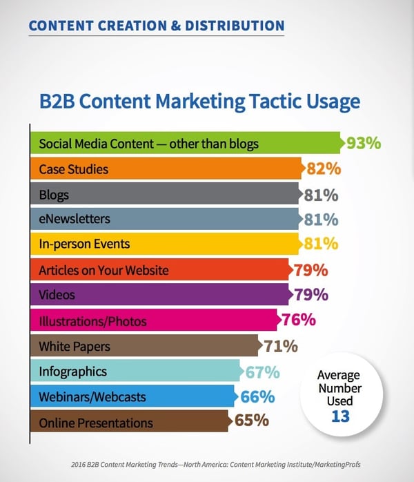
No wonder, 82% of companies use case studies as part of their B2B content marketing programs.
To create the best case studies, use the “Problem - Solution - Results” format, but infuse it with creativity, visuals and proof.
Highlight the problems of your target audience and how your company delighted them after they signed up with you.
Demonstrate tangible and quantifiable results to enforce your marketing messages.
After you’ve done the hard work of compiling a compelling case study, make sure you give it a prominent space on your website.
Remember, a great case study is worth every penny of the effort.
In our case, we’ve created a case study gallery on the home page to help visitors view case studies of their choice (screenshot below)
8) Don't Forget to Add Customer Testimonials
Consumer modernism is at its peak.
People have access to information at their fingertips, making it crucial for you to impress them within the few seconds they’ll stay on your website.
Especially with increasing competition in your industry, customer testimonials is, by far, the most effective tactic to woo customers and gain their trust.
At the end of the day, customers want the best for themselves, and if it’s backed by proof, then nothing like it.
If your business has positive reviews from customers, you must display them on your website to strengthen your value proposition.
You’ll be shocked to know that only 3% of people consider marketers & salespeople to be trustworthy (Hubspot Research)
Customer testimonials give you a chance to get customers, while giving them a chance to try your business’ services.
So, let them know that they should be confident in choosing you.
To achieve success at inbound marketing, leverage the trust of your happy customers to gain the trust of new ones.
When you design your business website, don’t hide your testimonials and success stories. Flaunt them.
Add them to your homepage and into your case studies, like how we’ve done below:
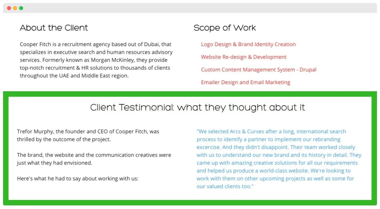
Make your client testimonials easy to find, so that potential leads find you easy to trust in.
After all, “A satisfied customer is the best business strategy of all” - Michael LeBoeuf, American business author & professor.
If you’re finding it difficult to gather testimonials, refer to this helpful guide by OptinMonster
9) Respond to Leads Faster Using Live Chat
Your customers want answers, and they want it yesterday.
The days of making leads wait for 24 hours to get a response, are over.
Now your business needs to be on the go, just like your customers.
Research suggests that the longer you wait to respond to customer queries, the higher are chances that you’ll lose business from them.
A research by Econsultancy discovered that “73% of customers were satisfied with their live chat experience, as compared to just 61% of email users and a worrying 44% of phone users.”
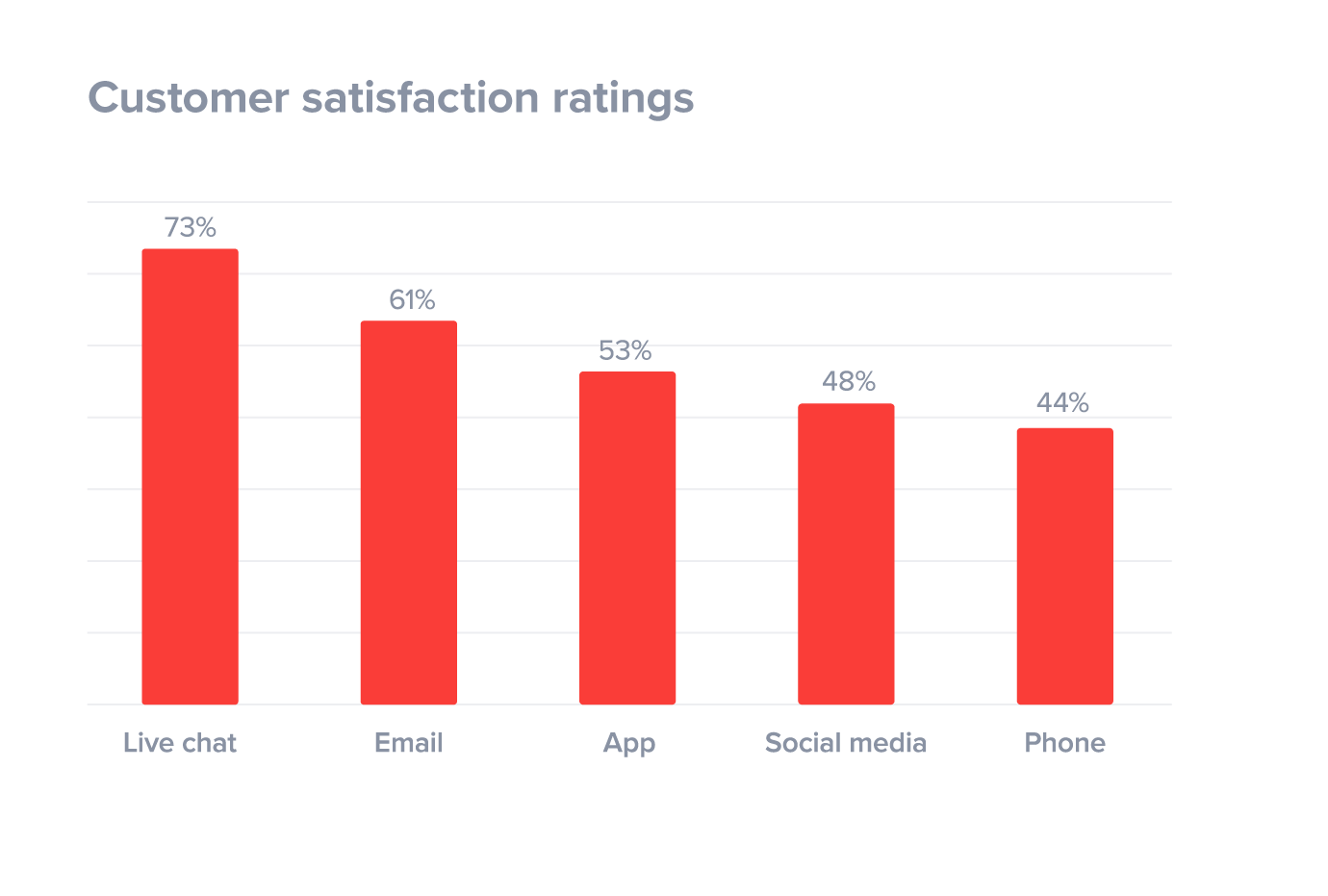
With live chat tools available in abundance, there’s no reason for your website to not have one.
We recommend HubSpot’s FREE live chat module that’s extremely easy to setup and use.
If you have a WordPress website, you won’t even need a web developer to install HubSpot’s live chat tool.
Simply install the “Contact Form Builder for WordPress” plugin and activate HubSpot live chat with a single click.
Integrating live chat within your website design is a guaranteed way to nurture prospects faster, giving you better inbound marketing results.
10) Make your Website Mobile-Friendly
89% of people are likely to recommend a brand after a positive brand experience on Mobile (Google, 2017)
The number of mobile users is increasing every year, implying that more people are visiting websites on their mobile devices than ever before.
Would you believe that the number of mobile phones exceeds the number of toothbrushes worldwide! (Consumer Technology Association, 2015)
This is a compelling enough reason to make your websites mobile-friendly and responsive.
If your website performs well on desktop, but gets distorted on mobile phones, you’ve lost at least 50% of visitors.
In a time where there’s cut-throat competition all around, not having a responsive website can cost your business dearly.
So how do you make your website design mobile-friendly to enhance your inbound marketing efforts?
Your first step should be to test it for yourself.
Try accessing your website on mobile phones and tablets to see how the user experience is.
If the website doesn’t load properly and looks like a distorted desktop version, it’s time to take action.
Another way of checking mobile-responsiveness is by using Google’s Mobile-Friendly Test.
Simply enter your URL and find out if your website design is fit for mobile usage.
You should pay attention to loading time, ease of navigation, adaptability of content and font size.
Since mobile phones are way smaller than desktops and laptops, take in account additional factors such as spacing and sizes of visual elements.
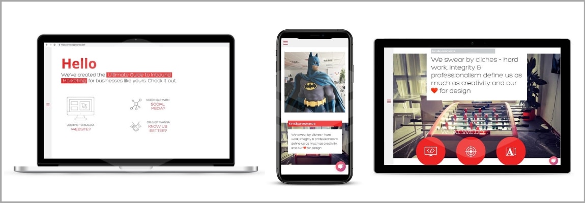
With consumers now spending more than five hours a day on their smartphone, you better level up or risk getting wiped out by your competitors.
Don’t know where to start?
Ask your web developer to redesign your website for mobile devices or simply get in touch with us for a complete website redesign.
Conclusion:
I hope by now, you've realized the importance of website design in inbound marketing.
Your main objective should be to provide a seamless user experience to your website visitors, so that they refer your business to their friends.
After all, word-of-mouth marketing still has the highest conversion rates.
By adopting inbound marketing, you have the best chance to increase word-of-mouth referrals, simply because inbound marketing is about providing a customer experience like no other.
To incorporate all the 10 website design elements into a complete online unit, we recommend developing your website on the HubSpot Content Optimization System.
It’s not just an ordinary web design platform.
It’s the next generation of website platforms for companies looking to fuse their website design and marketing efforts.
With features such as Smart Content (personalized content for each website visitor), built-in SEO module and Analytics Tracking, the HubSpot COS helps your business grow by identifying what you’re missing out on.
We're recognized as a top inbound marketing agency on DesignRush, which we're very proud of.
Our certified team of inbound experts, designers and web developers can help your website get the right kind of traffic that will completely change the way you generate business.


.jpg?width=1200&name=IBWD%20HS_COS_compressed%20(1).jpg)


